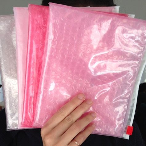
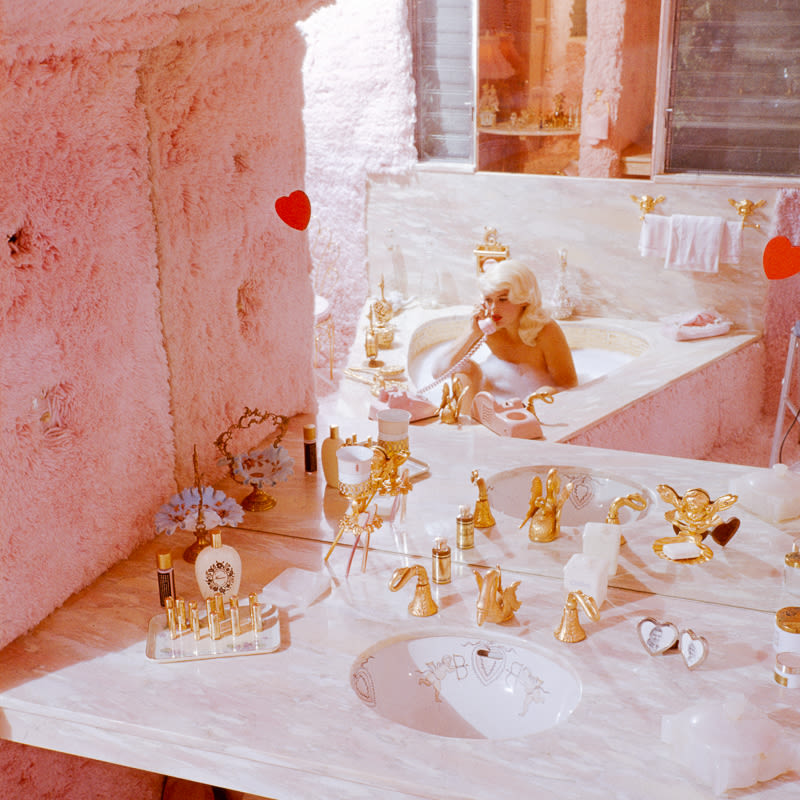
It was an email that tipped us off. A friend sent it part in jest and part in shameless flattery. “A Theory,” the subject line read, followed by the body text: “I'm pretty sure Glossier is to thank for bringing the color pink back this fall,”
Well that'd certainly be exciting, now wouldn't it? (We can't take all the credit—some praise must be given to that Angela Lansbury cover of The Gentlewoman, Carven's oversized pink coats for Fall 2013, the entire Acne brand, and Ms. Fernanda Ly.) Pink is certainly very 'of the moment' right now, and we're feeling it. So let's take a moment to look back: a little at the history of pink, and the brief story of Glossier's very particular hue of it.
Going all the way back to the 1700s, pastel colors (pink included) were worn by men and women—particularly children. Fast-forwarding to as recently as the 1920s, pink was a man's color—think Gatsby's suit (both in text and Robert Redford's Ralph Lauren version in the movie). This has given plenty of museum curators and researchers good reason to get to the root of why pink has since become so gendered in the opposite direction. Turns out, it was a post-WWII trend influenced as much by which dyes were easiest to come by for women's clothing as it was that song from Funny Face.
That said, Glossier's pink is for boys or for girls—it's a neutral (see the headline). It originally came from the endless photos posted to an iPhone photo stream over the course of a year while we were building the brand. On that stream (which was eventually printed out and posted to our central moodboard) there was Guinevere van Seenus in this Jil Sander ad. Also: Phoebe Philo on the cover of le Magazine du Monde. Both good examples that prove pink doesn't have to be girly. It can be cool! And androgynous. It can be a color that suits everyone.
Fittingly, Glossier's pink is actually quite cool in tone. It's also slightly translucent (there's actually no distinct Pantone for it—it's a 70 percent saturation of PMS 705, if we're getting specific). It's a tricky color to get right...but worth it, don't you think? We've got to hand it to the brave few who've experimented (and shared on Instagram, where all inspiration lives these days) with painting their apartment walls #glossierpink. That's true commitment. Benjamin Moore's Flush Pink is the shade to buy, if you're so inclined.
Photos via Getty and Glossier.
For more Glossier, head on over here.
